Designing Fluid Interfaces
Designing Fluid Interfaces is the video I like most in WWDC 2018. It explains why iOS 12 is so smooth from the perspective in theory.
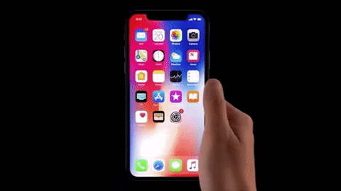
Gestures in Parallel With Thought
Parallel gestures allow users to discover a new gesture along the path of an existing gesture and lay their gestures at the speed of thoughts. The above is an example of interacting with app as it launches. Similarly, uses can also go to multitasking while app is launching, close app while launching app, and many more.

Respond to redirection as fast as possible
A good example is multi-tasking. A usual way is to detect users stop for a few of time, but it is too slow. Users intend to get to multi-tasking instantly. The solution here is to detect the vertical finger acceleration spike.

Soft Transitions
Even for 60fps, object moving too fast still looks strobing. A good way to solve this is motion blur. Apple uses this tech when launching / closing an app -- the icon blurs.

Reward Momentum with Overshoot
If users swipe to dismiss now playing, there is momentum in the direction, so it uses 80 percent damping to have a little bit of balance and squish making the gesture a lot more satisfying.

Bounciness can Hint
Bounciness can serve as a helpful hint that there's something more below the surface. In ioS 12, there is a flashlight button on the cover sheet. To avoid click by mistake, it requires a more intentioal gesture to activate. The bounciness here gives a hint to press a little bit more firmly.

Intent is Expressed through Motion
In the case above, there are actually 4 invisible region on the corners. With a motion happening through the gesture, we can read users intent of which corner to be intend to go. In this case, users do not need to drag across the whole screen.

Designing a Tap
The button should highlight immediately when users touch down on it. This tells users the button is working and the system is reacting to users gesture. Yet we shouldn't confirm the tap until figure up.

Designing a Tap
The button actually has a larger acceptance area than visible. This is to avoid failure tap by accident. When user moves out of the area, the button should be deactivate with color return to default state.

Provide Continuous Feedback
The focus engine on Apple TV continuously shows the move on the screen along with users movement. When users have horizontal acceleration spike, the focus changes to the next content.

Elevate Interactive Elements to a Seperate Plane
Lifting an interactive element to a seperate plane can help to distinguish it from the content. The toggle button above is an example.

Explainations
Explainations can be used when you just explicitly tell users how to use a gesture. It's best when you have one gesture that's used repeatedly in a bunch of places. You explain it once upfront and then just keep using it and keep reinforcing it to teach users.